Psychology of Colours

The Psychology of Color in Commercial Spaces: How to Influence Customers Through Design

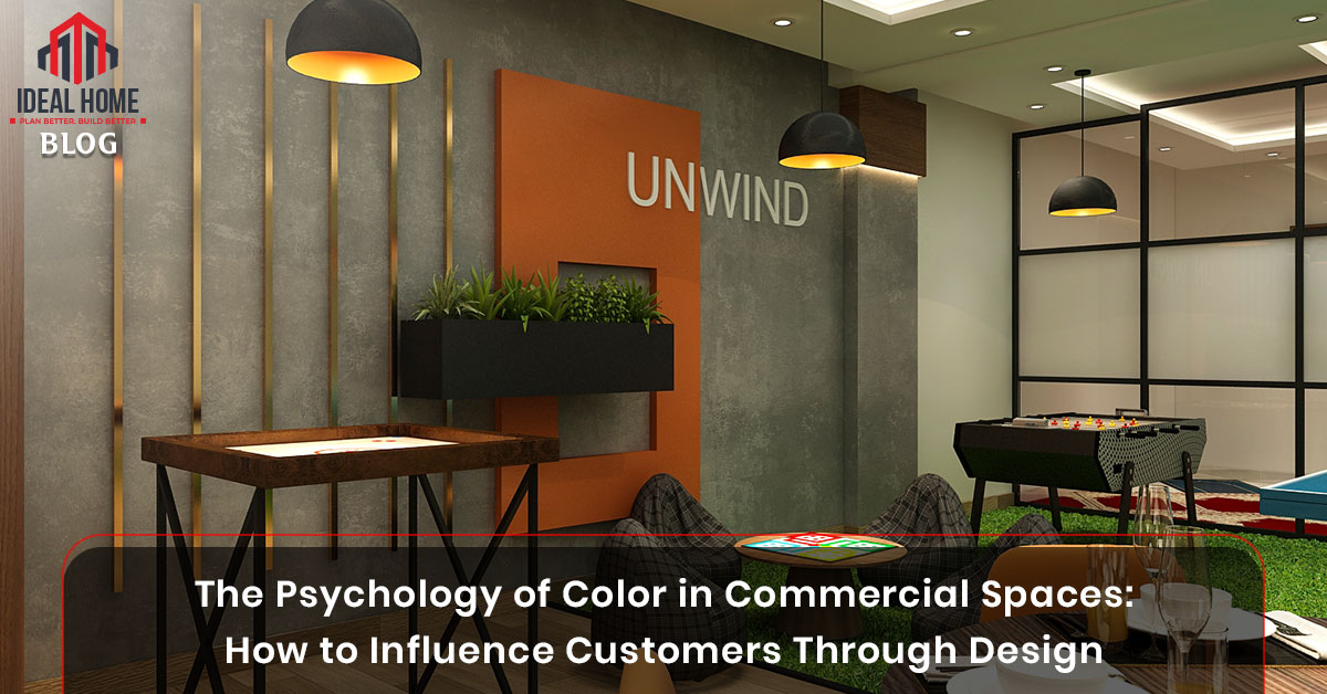
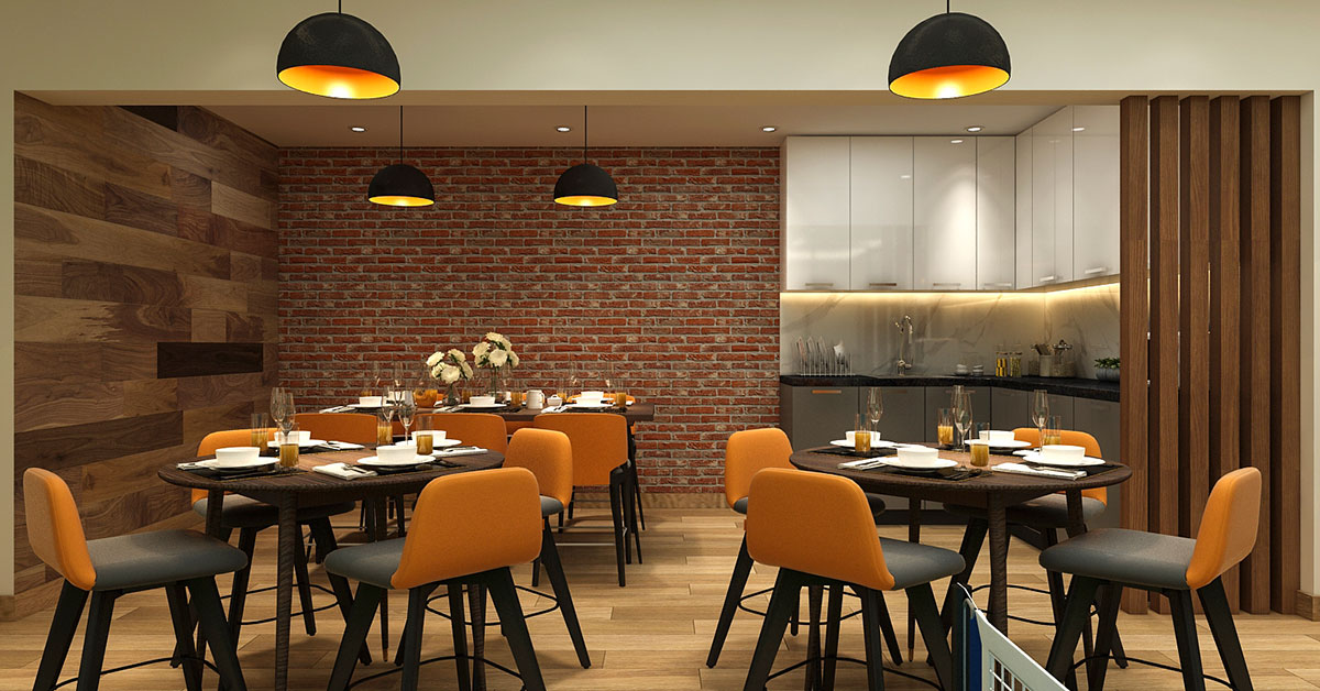
When customers walk into a restaurant, office, or retail store, their first impression is not just shaped by the layout but also by the colors around them. This is the essence of the psychology of color in commercial spaces—a powerful design strategy that influences mood, decision-making, and purchasing behavior.

In today’s competitive business environment, understanding color psychology in interior design can make the difference between a space that feels inviting and one that turns customers away.

The Role of Color in Customer Psychology

Psychology of Colours

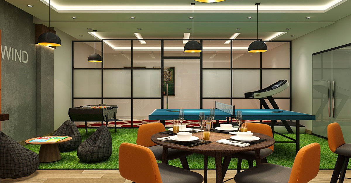
Colors are more than decorative choices—they evoke emotions and associations. Studies in environmental psychology reveal that different colors can affect:

  • Customer dwell time (how long they stay)
  • Perception of space (open, cozy, modern, luxurious)
  • Spending behavior (impulse buying vs. thoughtful purchasing)
  • Brand recall (memorability of the experience)

According to Color Psychology Research, 90% of customers make subconscious judgments about products and spaces based on color alone.

Best Colors for Different Commercial Spaces

Psychology of Colours

1. Retail Stores

  • Red & Orange → Create urgency, stimulate impulse buying.
  • Blue → Builds trust, often used in tech and electronics stores.
  • Yellow → Captures attention, works well for promotions.

Example: Global brands like McDonald’s use red and yellow strategically to stimulate appetite and quick decision-making.

2. Restaurants & Cafés

  • Warm Colors (Red, Brown, Orange) → Enhance appetite and social interaction.
  • Green → Signals health, freshness, and sustainability.
  • Neutral Tones → Create cozy, relaxed dining atmospheres.

See how Starbucks uses green branding to connect with eco-conscious customers while creating a calming café environment.

3. Offices & Workspaces

  • Blue → Improves focus and productivity.
  • Green → Reduces stress and increases creativity.
  • White & Gray → Promote clarity, but too much can feel cold.

Read: The Psychology of Office Interior Design to explore how colors and layouts boost employee performance.

4. Hospitality Spaces (Hotels, Lounges, Resorts)

  • Gold & Purple → Symbolize luxury and exclusivity.
  • Earthy Tones (Beige, Brown, Olive Green) → Create warmth and relaxation.
  • Blue & Aqua → Used in spas and resorts for tranquility.

Color Psychology and Branding

Consistency between brand identity and interior color schemes is critical. For example:

  • Coca-Cola → Red: Energy, excitement, passion.
  • Apple → White & Silver: Minimalism, sophistication, innovation.
  • Starbucks → Green: Growth, health, eco-friendliness.

If your brand colors are not reflected in your commercial space, you may confuse customers and weaken brand recall.

Tips for Using Color Psychology in Commercial Interiors

  1. Understand your target audience → Younger audiences may prefer bold colors, while professionals lean toward neutrals.
  2. Balance bold shades with neutrals → Prevents overstimulation.
  3. Use accent colors strategically → Highlight promotions, seating zones, or pathways.
  4. Test lighting with color schemes → Natural and artificial light can alter perception of color.

Conclusion: Color is a Silent Salesperson

The psychology of color in commercial spaces is not just about making a store or office look attractive—it’s about influencing emotions, shaping customer journeys, and reinforcing brand identity.

By choosing the right color palettes, businesses can:

  • Increase customer satisfaction
  • Encourage repeat visits
  • Drive sales and brand loyalty