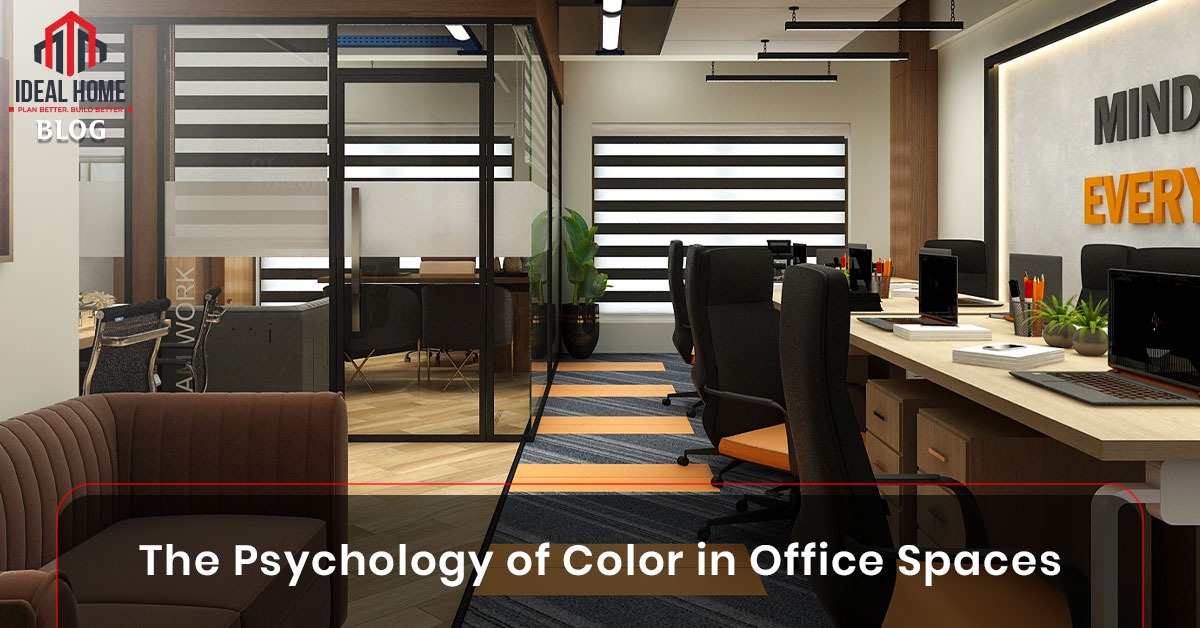
In today’s fast-paced corporate world, productivity and employee satisfaction are more crucial than ever. Office design isn’t just about aesthetics—it plays a vital role in how people think, feel, and perform. One of the most underestimated elements in design is color.
The psychology of color explores how different hues can influence mood, behavior, and efficiency. Whether you’re revamping your home office or redesigning a full corporate floor, understanding how color impacts performance is essential. In this article, we’ll dive deep into how color choices in office spaces can shape employee productivity and emotional well-being—and how to make informed design decisions.
Color affects us on a biological and psychological level. For example, red can increase heart rate and adrenaline, while blue can induce calmness and improve focus. Our brains react subconsciously to color cues, influencing everything from stress levels to decision-making capabilities.
Research has shown that businesses applying color psychology in office design have seen improvements in focus, communication, and overall morale. Companies are now hiring interior designers in Pakistan to incorporate strategic color schemes into their spaces—not just to look good, but to work better.
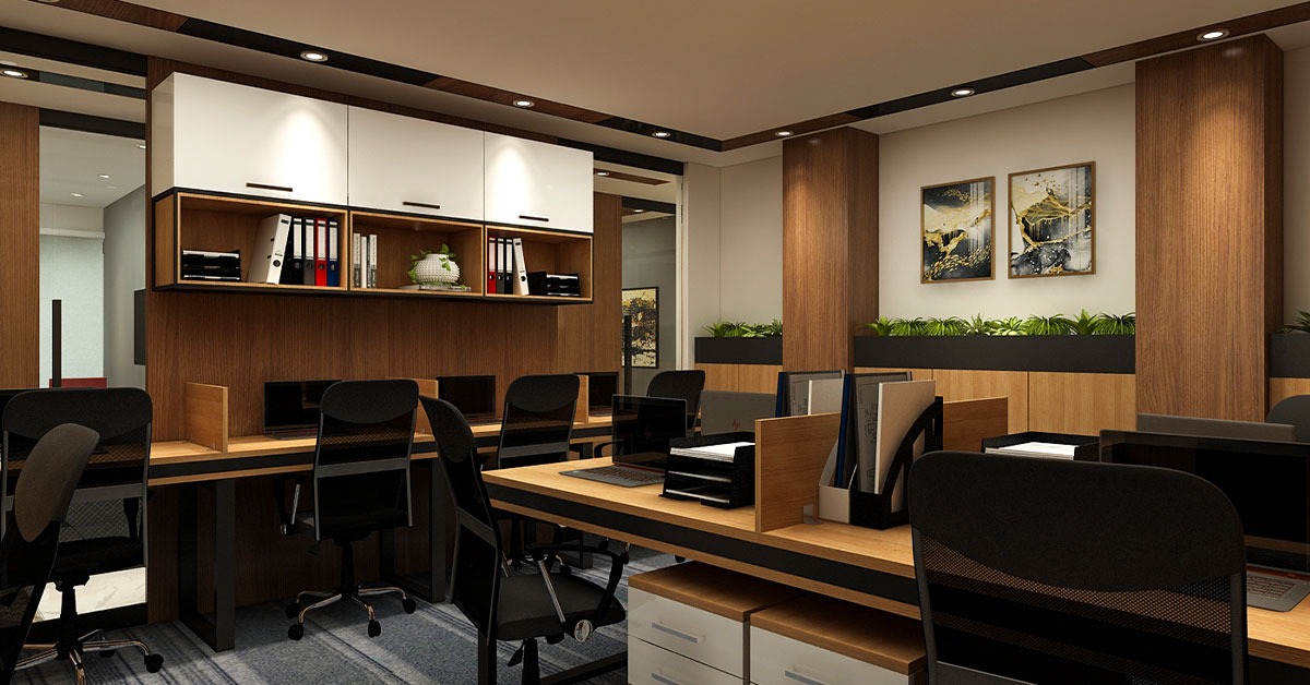
Here’s a breakdown of commonly used colors in office interiors and their psychological effects:
If you’re working with a limited budget, using accent walls or colored furnishings is a smart way to introduce these colors without an expensive overhaul.
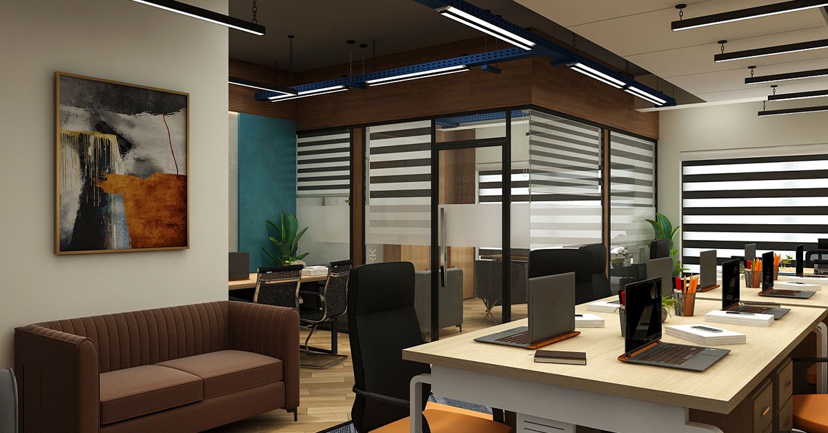
Modern offices are becoming smarter about how they use color. Instead of a one-size-fits-all approach, many businesses now apply color zoning—designating specific colors for different zones of work.
For example:
This kind of color planning improves both the functionality and feel of a workspace.
Need help with planning your own space? Explore our services to learn how we customize office interiors using color psychology.
Let’s break down why this strategy matters:
When you align your office colors with your company culture and tasks, you set your team up for success.
In Pakistan, we are seeing a shift in how businesses perceive office design. Instead of plain, uninspired environments, more companies are reaching out to interior designers in Pakistan to inject thoughtful design principles into their spaces—including color science.
With rising awareness of mental health and work-life balance, Pakistani startups, corporations, and even co-working spaces are embracing color psychology to cultivate happier and more productive teams.
Whether you’re a business owner, HR manager, or freelancer, here are practical tips to integrate color psychology into your office:
Ready to make your office pop? Book a consultation now with our design experts.
Color has the power to elevate or dampen your workplace. Choosing the right shades can lead to improved efficiency, creativity, and mental well-being. Whether you’re starting from scratch or doing a quick office revamp, understanding color psychology is key.
At Ideal Home, we don’t just design spaces—we design experiences. Let’s work together to bring out the best in your people and your place.
IDEAL HOME | All Rights Reserved | Powered By The Velocity Digital Marketing